Redesigning Crypto Wallet to Improve Asset Engagement
Through product data, behavioral analysis, and customer feedback, I uncovered friction points that limited deeper engagement and redesigned the wallet to encourage more exploration and financial actions.
What I did
Behavioral data analysis
Problem framing
Hypothesis formation
Interaction design
Cross-functional collaboration
Collaboration
Proud Srisa-an (PM)
Jesada Hongsi (FE)
Sukit Kajonpradapkul (BI)
Sutthikan Singkhonart (CS)
Company

Timeline
Jan - Feb 2026
Background
Overview
Bitazza is a cryptocurrency exchange based in Thailand. It allows users to buy, sell, and trade digital assets on both web and mobile.
As the platform grew, Bitazza started a broader product revamp to improve the overall app experience. One key area was the Wallet. The existing one was originally built during the early MVP stage, before the company had an in-house product design team. Because of this, that interface focused mainly on functionality rather than long-term user experience.
My role
I led the end-to-end redesign of the Wallet as part of a broader product revamp.
The initial goal was to improve the wallet experience and interface that had been built during the early MVP stage. However, after reviewing product data, user behavior, and customer support feedback, I found that the problem went beyond usability.
Most users only used the wallet for quick balance checking, with very little engagement afterward. This shifted the project direction from redesigning wallet flows to exploring how the wallet could become a place users would return to and engage with over time.
What the data revealed
The status quo of Bitazza: Retention and Engagement
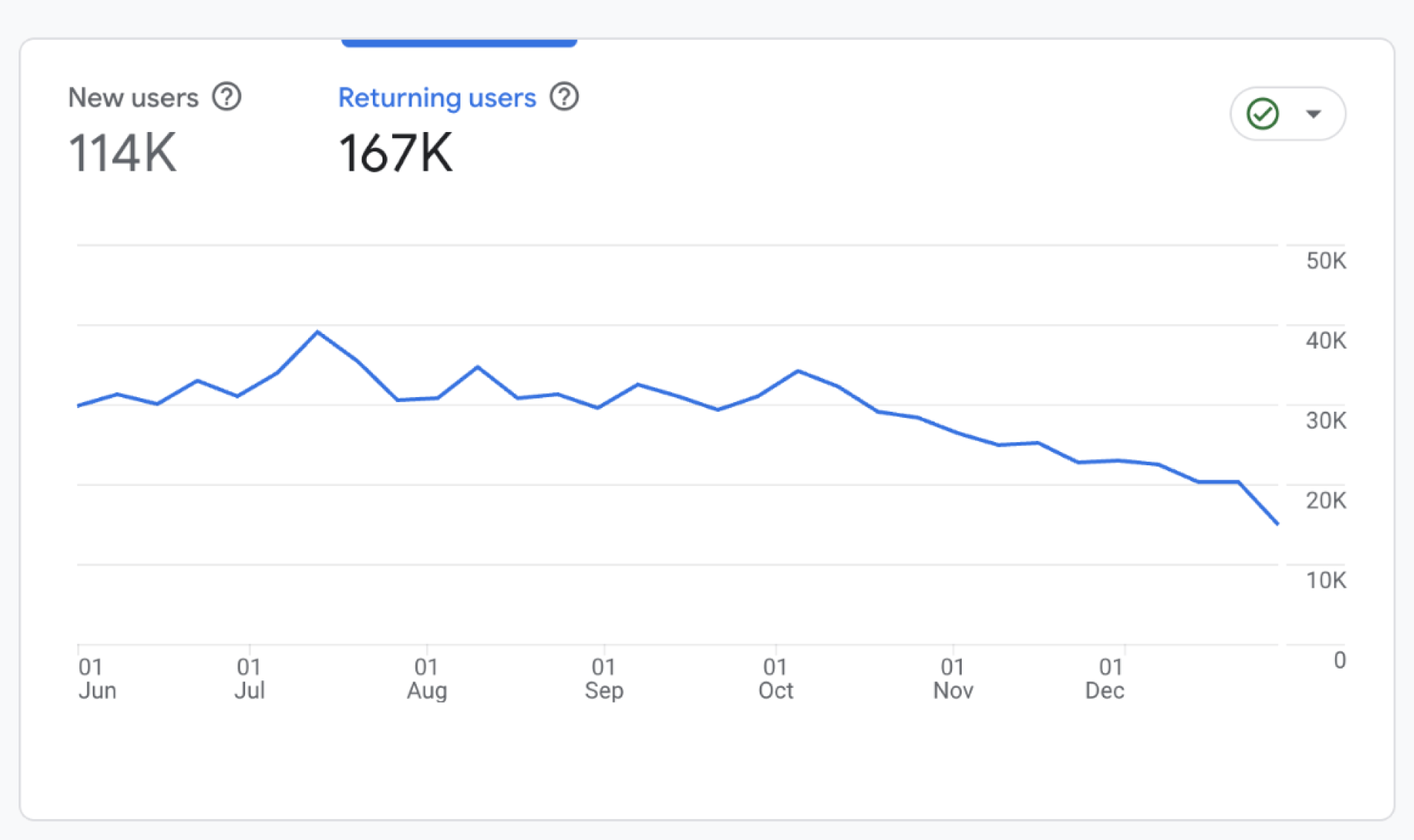
I started by reviewing product data over the past 180 days (Jun 1 – Dec 31, 2025).
At a high level, retention showed a gradual decline over time. We had around 167k active users, but 114k of them were new users.
This suggested that while the platform continued acquiring new users, many users did not develop a strong habit of returning.
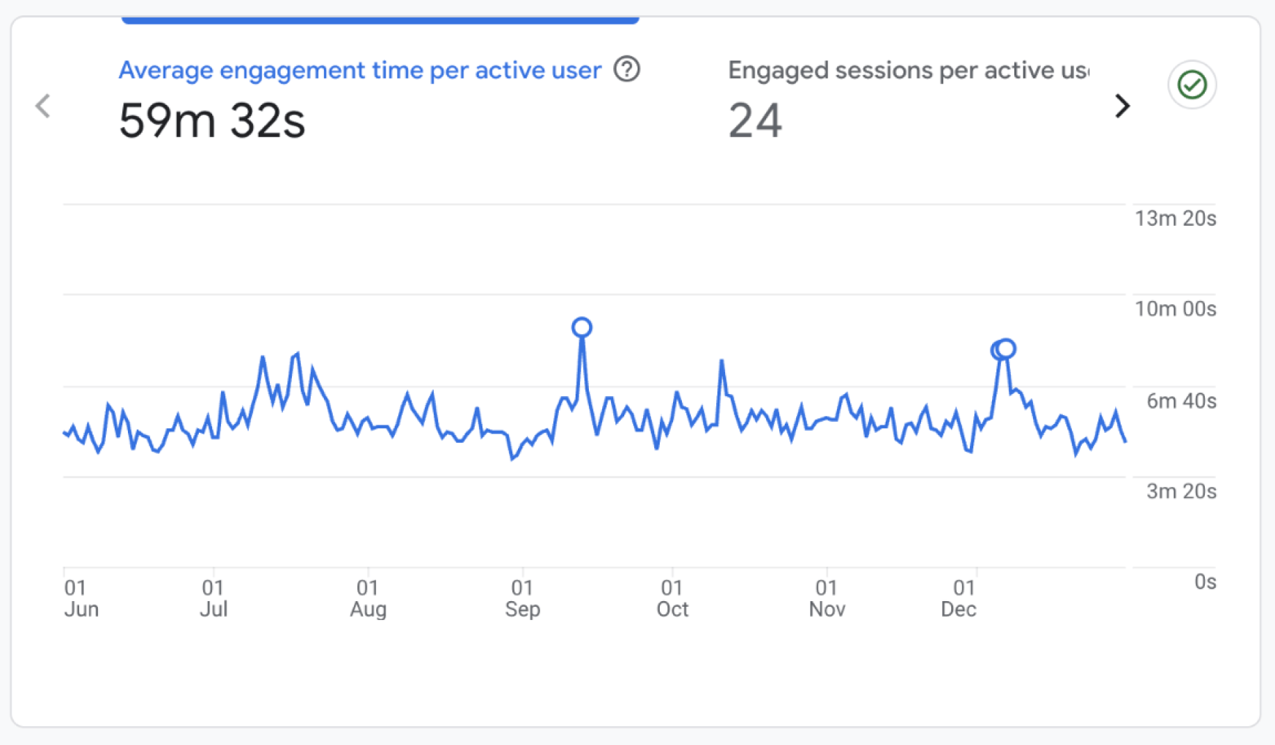
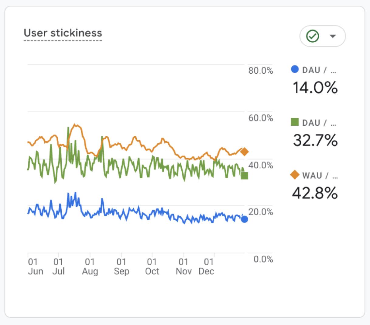
Looking into engagement metrics, users spent an average of 59 minutes in the app over six months, suggesting that most interactions were brief and transactional rather than ongoing engagement behaviors. Also, the DAU/MAU ratio was also around 14%, indicating relatively low daily engagement across the platform.
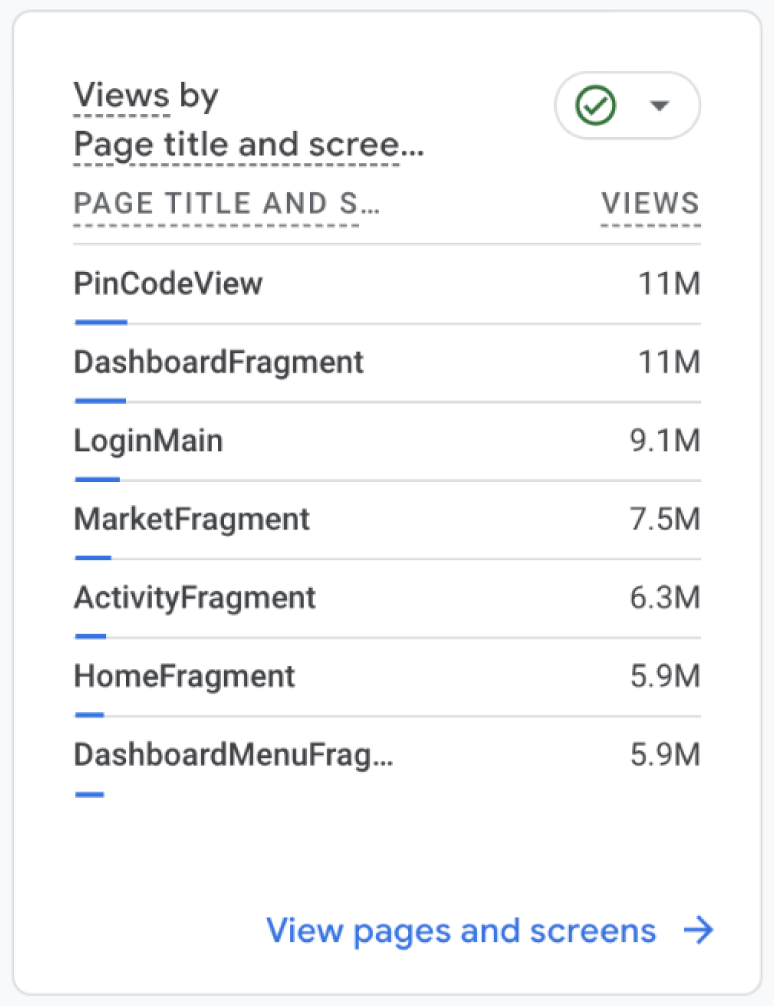
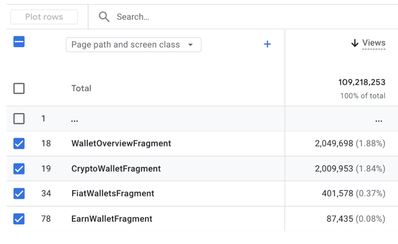
Now, I decided to deeper into the screen-level engagement. It's easy to spot that wallet-related screens accounted for only a small portion of total interactions compared to other parts of the product like Dashboard or Market. This means that users mainly treated the wallet as a place to check balances rather than manage assets.
Then... what outcome should I aim at?
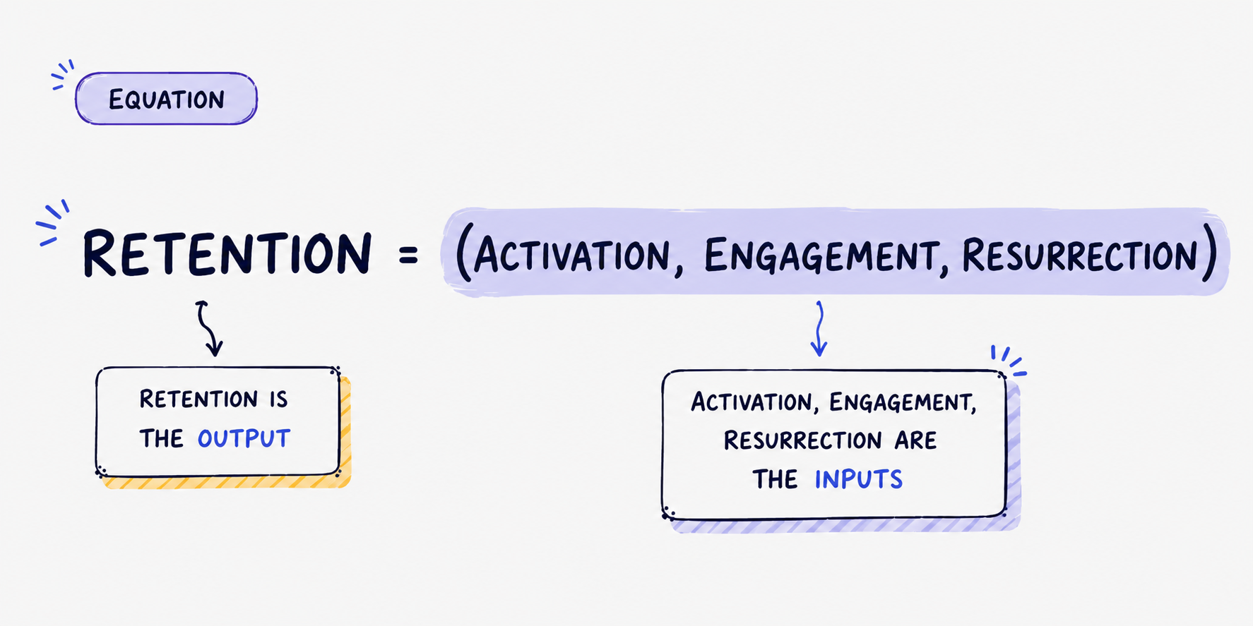
In product growth, engagement is one of the inputs that drives retention. Retention measures how many users continue returning over time, while engagement reflects how meaningfully users interact with the product once they return.
In this case, retention wasn’t something the wallet redesign could solve directly. The more practical way was to improve how users engaged with their assets. Strengthening wallet engagement would then become one of the ways to support better long-term retention across the product.
👉 The opportunity wasn’t only to improve wallet usability, but to make the wallet a place users would actively return to and engage with, helping support stronger long-term retention across the product.
Reframing wallet engagement behavior
Understanding the habit loop
To better understand why wallet engagement remained shallow, I mapped the current experience using an engagement loop framework.
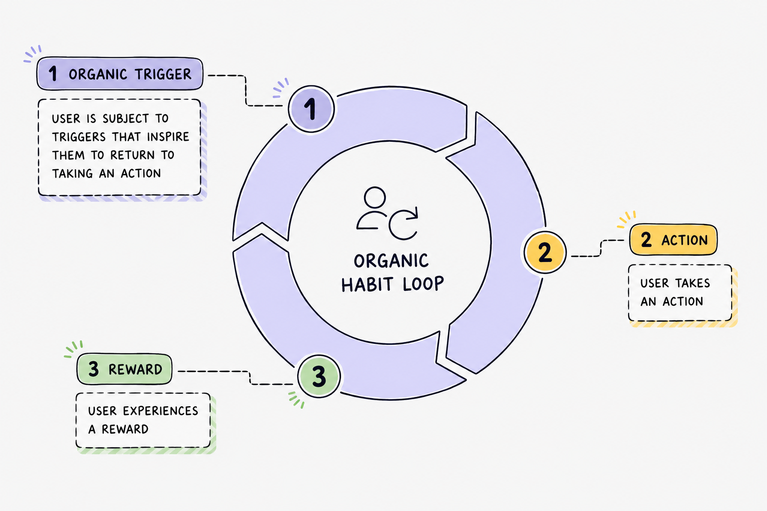
Strong engagement loops are created when users repeatedly experience meaningful rewards after taking an action.
Current Bitazza wallet habit loop
In crypto products, triggers already happen naturally: price movements, volatility, and portfolio fluctuations continuously bring users back. However, the current wallet experience failed to turn those moments into deeper engagement behaviors. This is because the reward was weak, users can only see their balance.
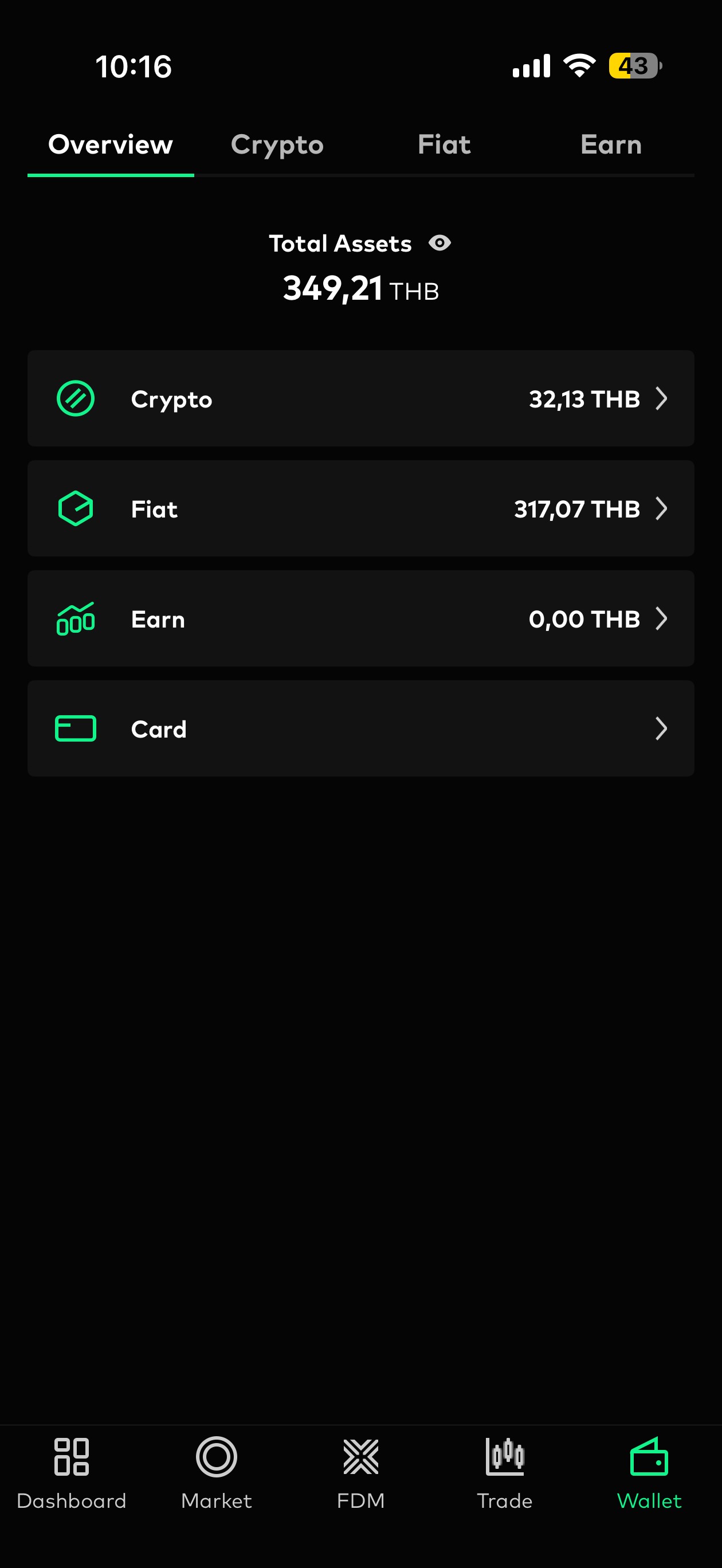
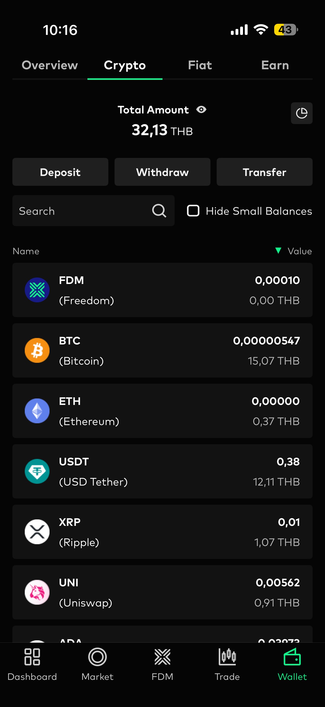
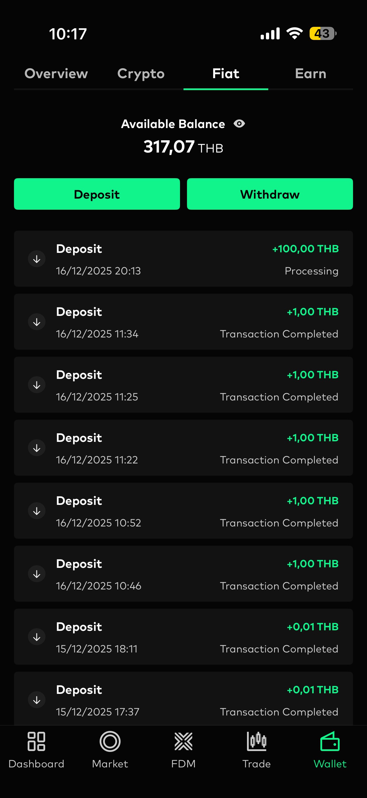
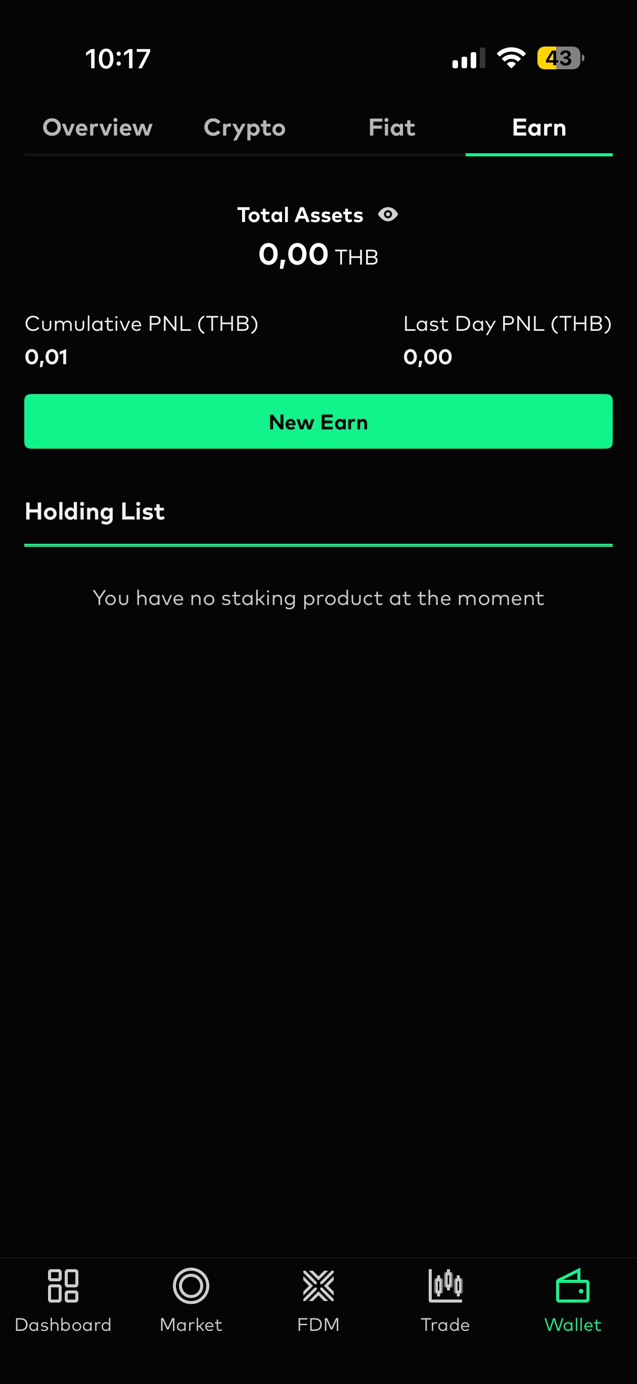
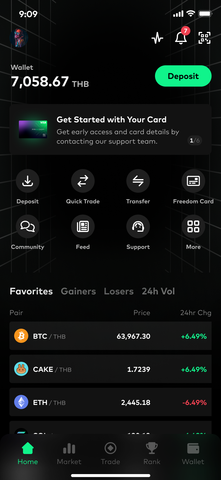
Current wallet had only some basic information about the balance. This didn’t seem to motivate users to revisit this page more often.
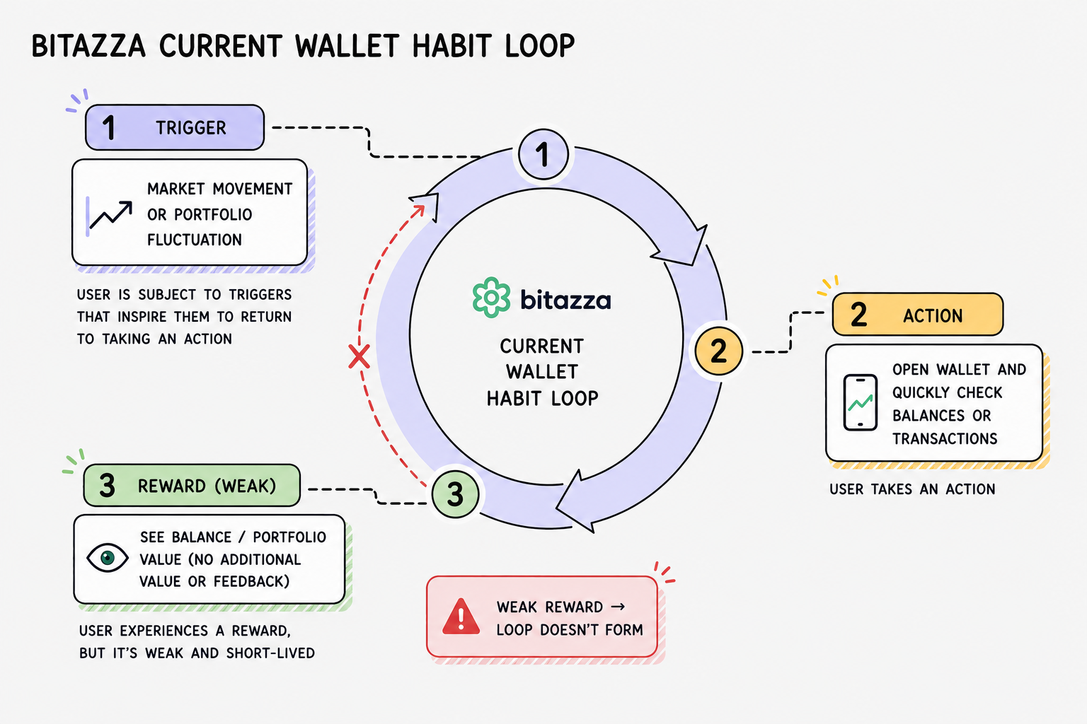
The reward was too weak to reinforce continued engagement, causing most interactions to end after quick balance checks.
Investigating the weak reward experience
Although users frequently returned to the wallet, most interactions remained shallow. To clearly figure out what to enhance, I did the heuristic evaluation, competitive analysis, and asking feedbacks from CS team.
From these observations, I synthesized two core gaps the redesign needed to improve the reward in the habit loop:
🔴 Wallet didn’t help users confidently understand their assets
The wallet mainly showed balances, and gave users little understanding of how their portfolio was changing or what activities had happened across their assets. As a result, the experience felt passive and informational rather than actionable.
Insights from: Product Data, CS, Heuristic Evaluation
🔴 The wallet didn’t encourage deeper exploration and action-taking
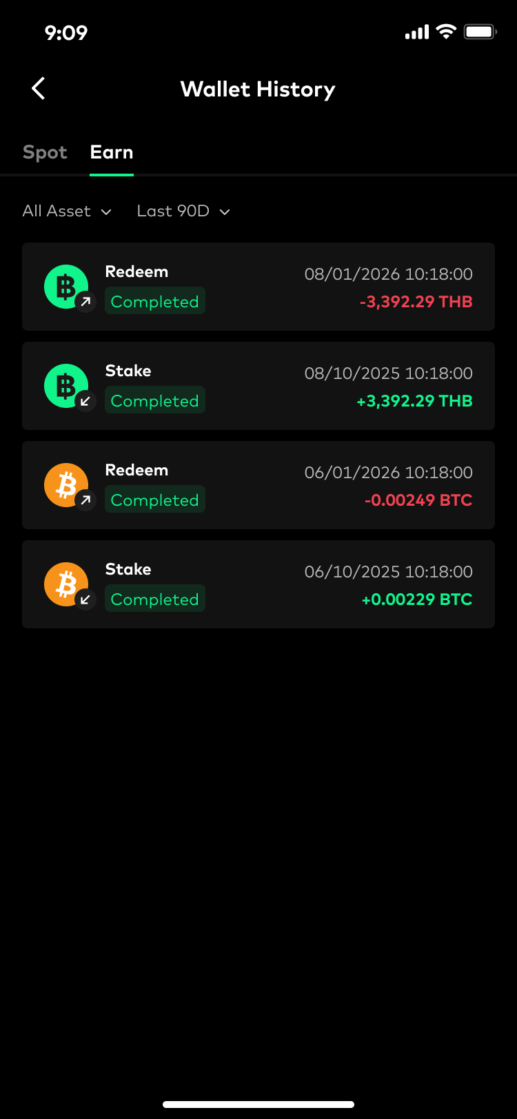
Most wallet interactions ended after quick balance checks. Beyond the visible Earn tab, the experience gave users little reason to continue exploring, monitor opportunities, or move into trading and earning actions.
Insights from: Product Data, CS
Designing the solution
Turning insights into product directions
After identifying the core problems, I mapped them into a set of product directions and feature opportunities for the wallet redesign. Before moving into detailed UI design, I worked closely with the PM and engineering team to validate the feasibility and scope of these ideas.
Final design
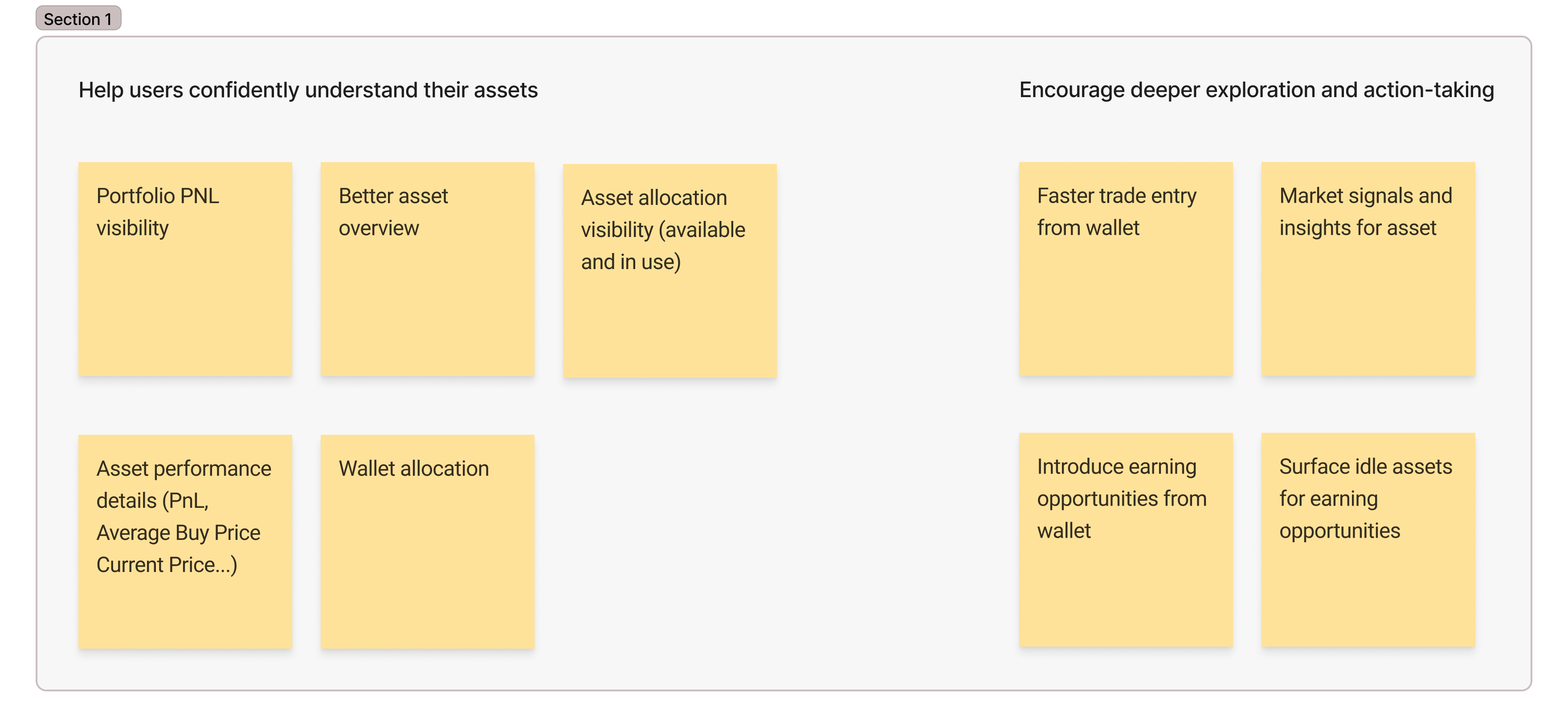
Goal 1: Help users confidently understand their assets

Users can track portfolio performance and understand asset allocation over time
Users can quickly scan how each asset contributes to their overall portfolio
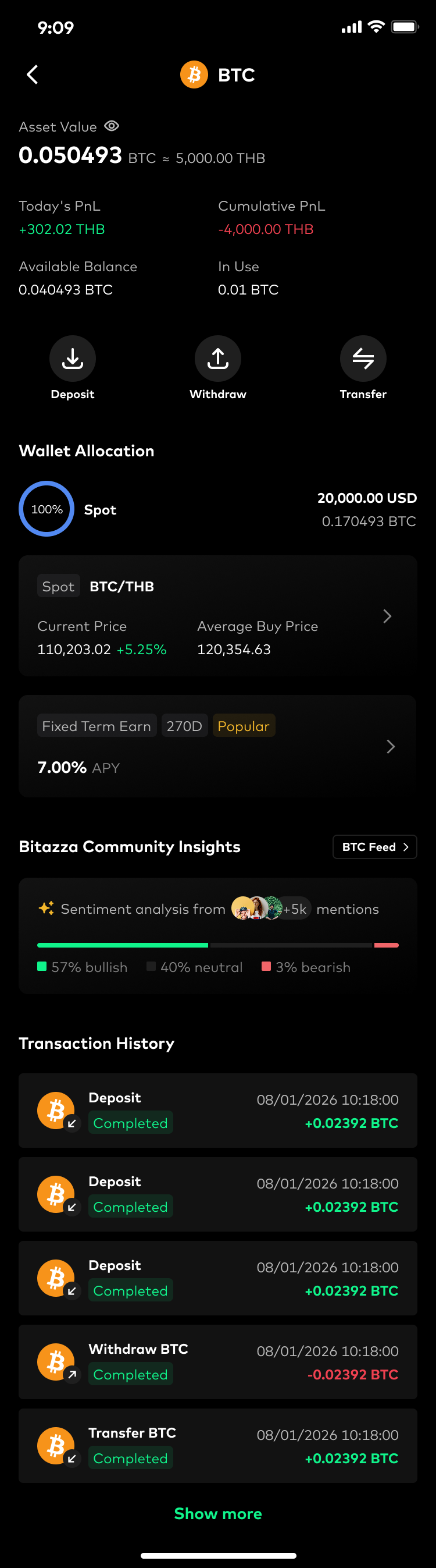
Users can evaluate a specific asset with deeper performance and position details
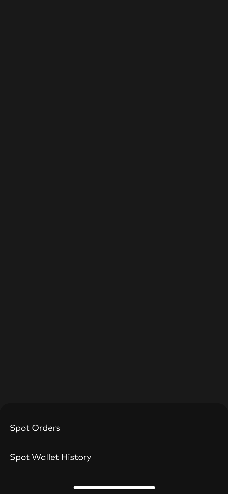
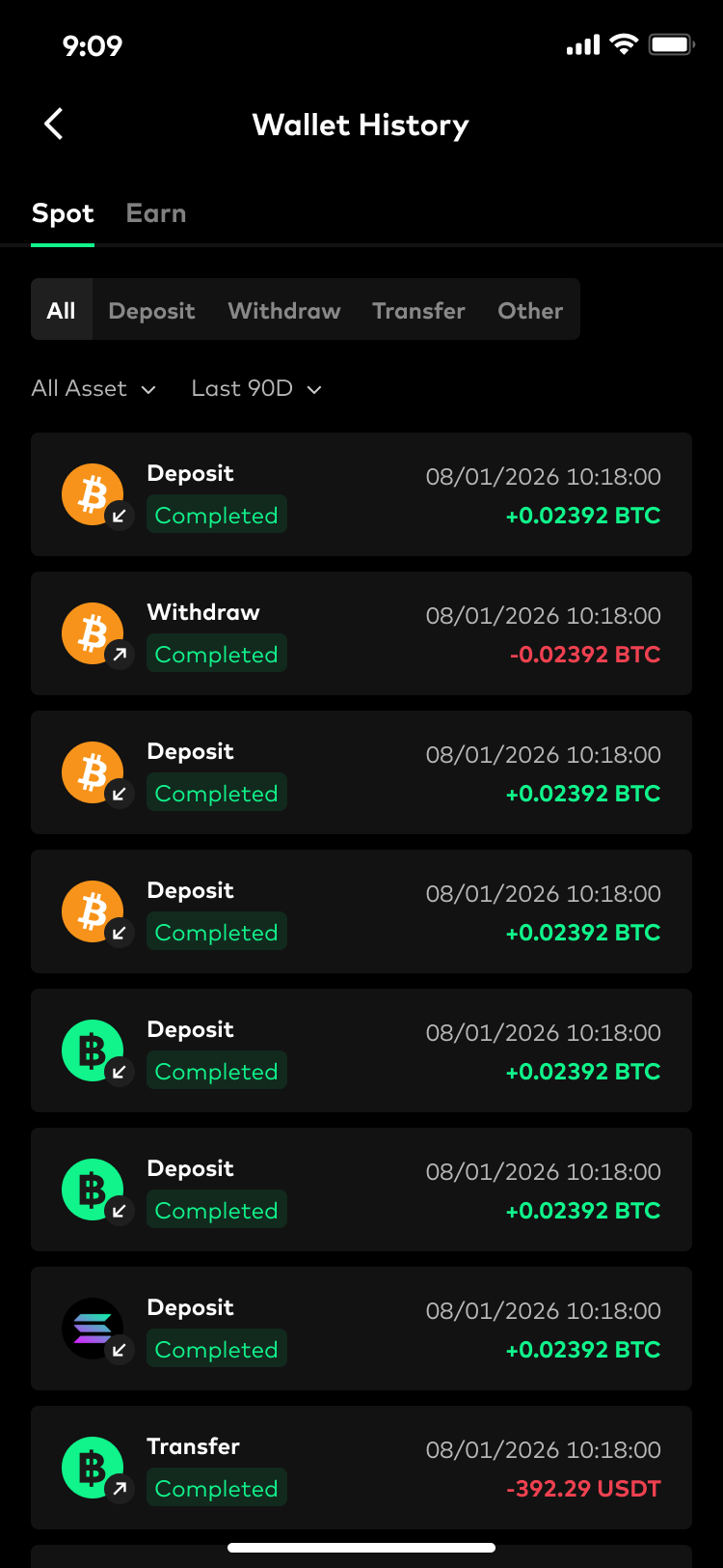
Users can clearly track what happened across their wallet activities
Users can clearly understand where their funds are being used
Users can quickly understand which assets are available for actions and which are currently in use
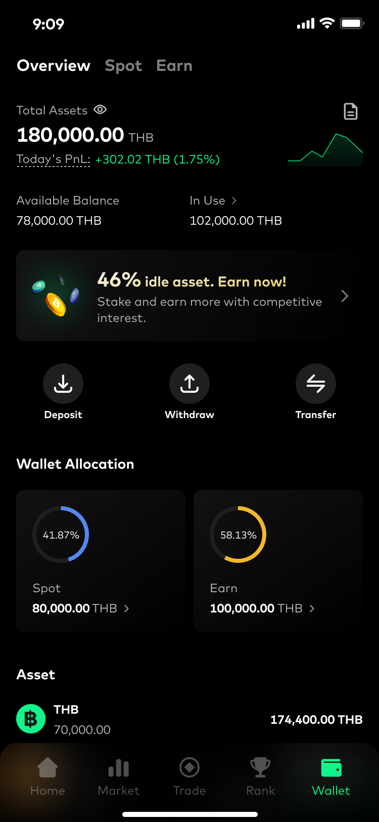
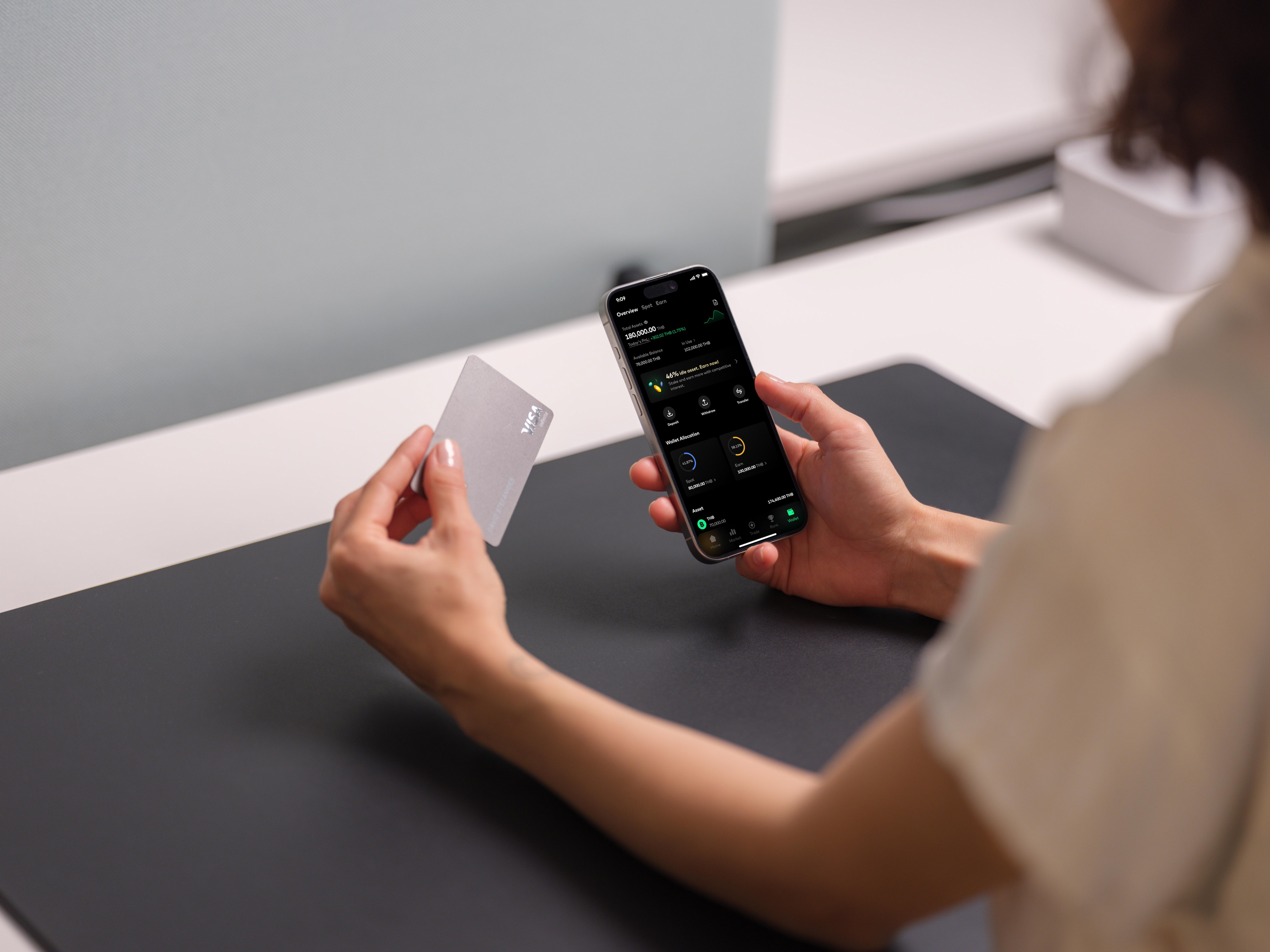
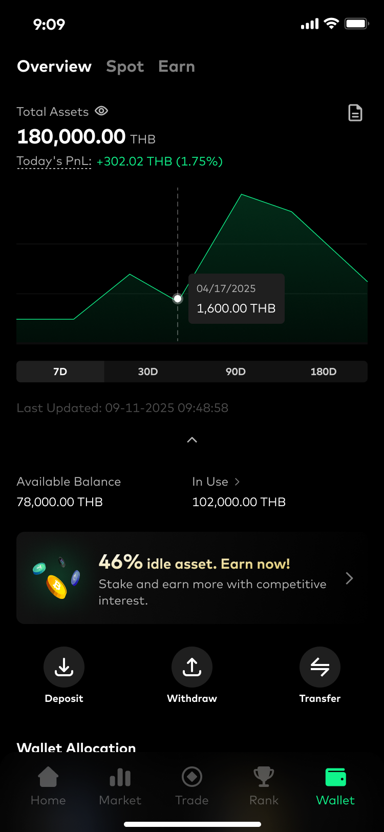
Wallet Overview
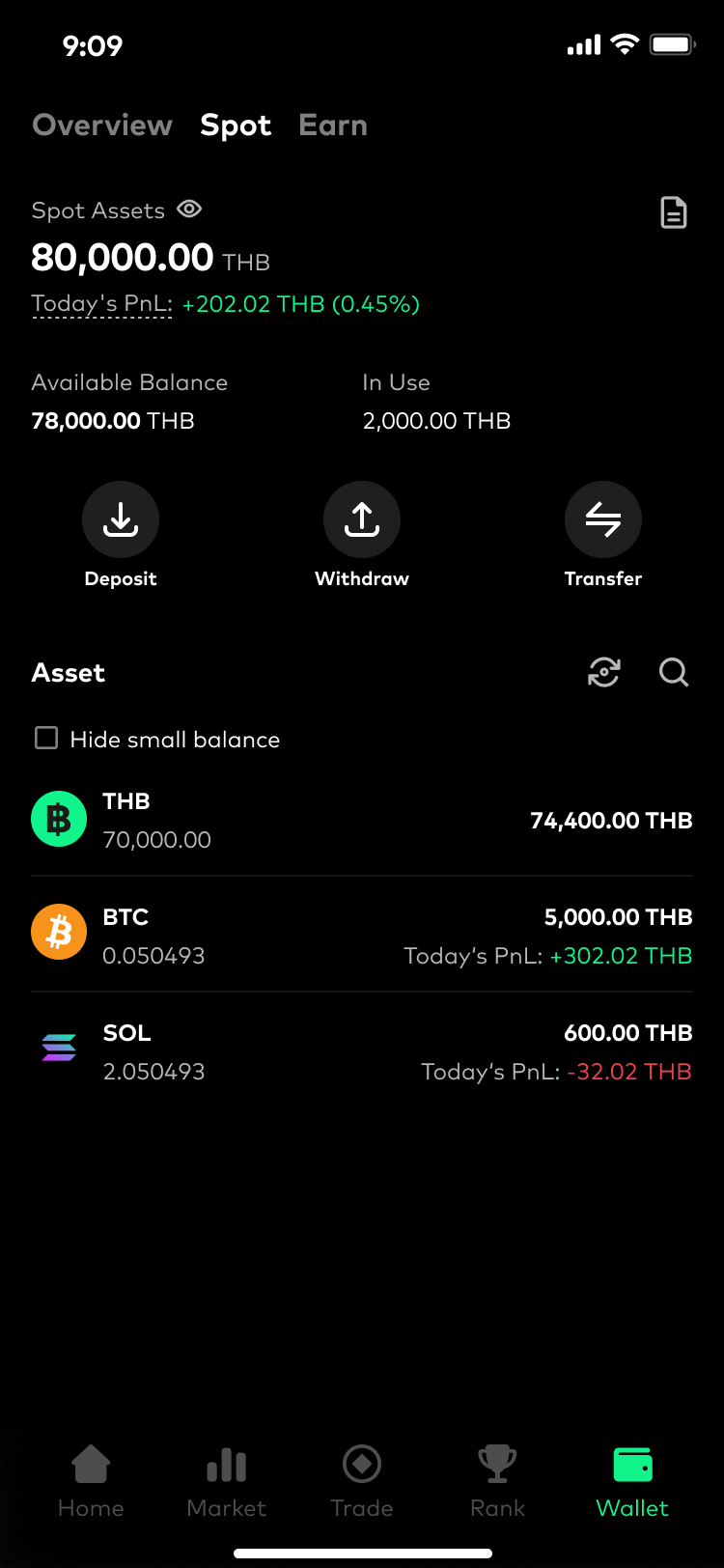
Spot Wallet


Goal 2: Encourage deeper exploration and action-taking
Entry points for actions
Earn

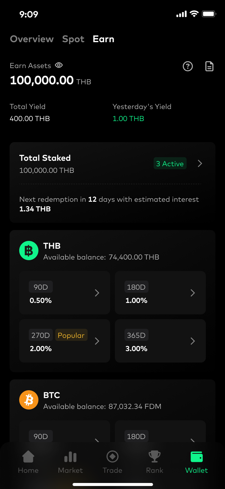


Users can better understand whether an asset is performing well by seeing its PnL, average buy price, market sentiment, and earning opportunities
Users become aware that part of their portfolio is sitting idle and can be put into earning products
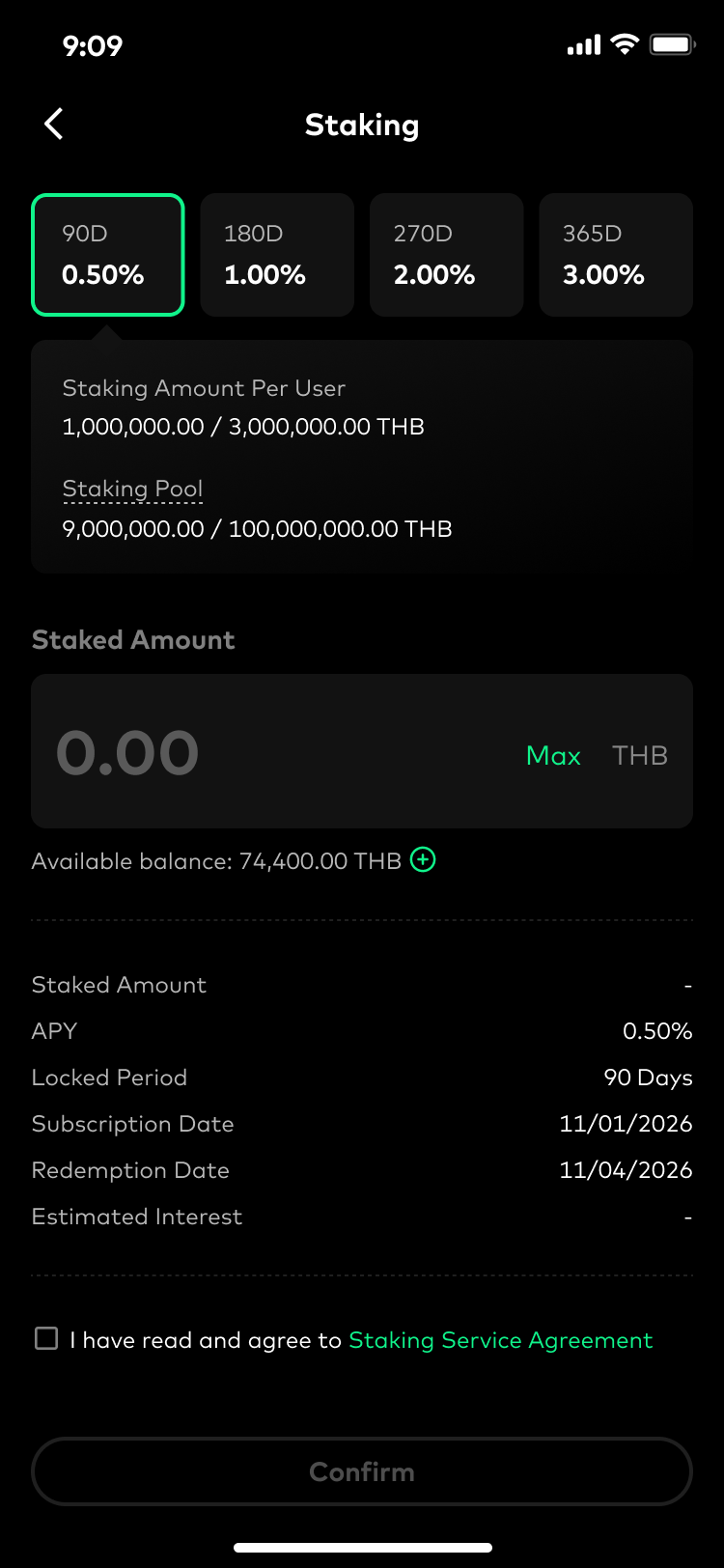
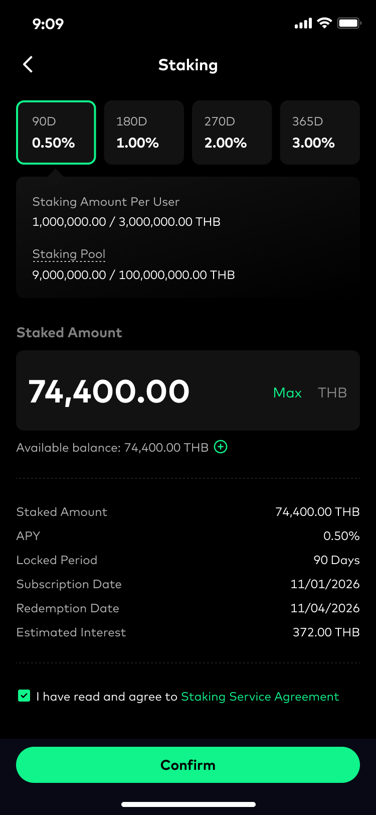
Users can compare staking options and preview estimated returns before committing funds
Reflection
How framing shaped the solution
One thing I reflected on from this project was how much the framing of a problem can influence the direction of a design. Sometimes, the requirement a product designer receives can sound very straightforward. In this case, simply “redesign the wallet.” But the way we choose to interpret that requirement can lead to very different outcomes.
If I had approached this purely as a usability redesign, the solution would likely have focused on improving layouts, navigation, and information clarity. Instead, by looking at the wallet through the lens of growth, the project became less about redesigning a screen and more about understanding why users returned and what they did afterward. That shift in perspective ended up shaping both the design decisions and the overall direction of the project.
Thinking about success beyond the redesign
Since the redesign was still in development at the time of this case study, I wasn’t able to measure post-launch impact yet. However, one thing I found important was thinking ahead about how success should eventually be evaluated, not only through usability improvements, but also through behavioral and business signals inside the wallet experience.
Instead of treating retention as a direct design outcome, I focused more on the engagement behaviors that could contribute to stronger long-term retention over time. Here are some metrics I could check later:
Engagement signals
Move users beyond simple balance checking toward more active asset engagement.
Repeat wallet visits
Asset detail views
Interactions with trading and earning entry points
Business signals
Turn wallet engagement into meaningful financial actions.
Trading conversion from wallet
Staking conversion from wallet
Acknowledgement
This project benefited greatly from collaboration across multiple teams.
Special thanks to Proud Srisa-an (Product Manager) for connecting me with the right stakeholders and helping coordinate the project. I also appreciate Jesada Hongsi (Frontend Engineer) for managing the Google Analytics setup, making sure events were tracked correctly, and sharing internal training on how to read product data. Sukit Kajonpradapkul (Business Intelligence) contributed quantitative insights beyond GA dashboards, helping me validate patterns in user behavior. Finally, Sutthikan Singkhonart (Customer Support) shared qualitative insights from real user interactions, helping surface pain points that were not visible in analytics alone.
This project would not have been possible without their collaboration and support.
More case studies
Let's work together
Feel free to reach out. I’d love to hear what you’re working on.

Work
About me
Notes
Gallery
Contact
Redesigning Crypto Wallet to Improve Asset Engagement
Through product data, behavioral analysis, and customer feedback, I uncovered friction points that limited deeper engagement and redesigned the wallet to encourage more exploration and financial actions.
What I did
Behavioral data analysis
Problem framing
Hypothesis formation
Interaction design
Cross-functional collaboration
Collaboration
Proud Srisa-an (PM)
Jesada Hongsi (FE)
Sukit Kajonpradapkul (BI)
Sutthikan Singkhonart (CS)
Company
Timeline
Jan - Feb 2026
Background
Overview
Bitazza is a cryptocurrency exchange based in Thailand. It allows users to buy, sell, and trade digital assets on both web and mobile.
As the platform grew, Bitazza started a broader product revamp to improve the overall app experience. One key area was the Wallet. The existing one was originally built during the early MVP stage, before the company had an in-house product design team. Because of this, that interface focused mainly on functionality rather than long-term user experience.
My role
I led the end-to-end redesign of the Wallet as part of a broader product revamp.
The initial goal was to improve the wallet experience and interface that had been built during the early MVP stage. However, after reviewing product data, user behavior, and customer support feedback, I found that the problem went beyond usability.
Most users only used the wallet for quick balance checking, with very little engagement afterward. This shifted the project direction from redesigning wallet flows to exploring how the wallet could become a place users would return to and engage with over time.
What the data revealed
The status quo of Bitazza: Retention and Engagement
I started by reviewing product data over the past 180 days (Jun 1 – Dec 31, 2025).
At a high level, retention showed a gradual decline over time. We had around 167k active users, but 114k of them were new users.
This suggested that while the platform continued acquiring new users, many users did not develop a strong habit of returning.
Looking into engagement metrics, users spent an average of 59 minutes in the app over six months, suggesting that most interactions were brief and transactional rather than ongoing engagement behaviors. Also, the DAU/MAU ratio was also around 14%, indicating relatively low daily engagement across the platform.
Now, I decided to deeper into the screen-level engagement. It's easy to spot that wallet-related screens accounted for only a small portion of total interactions compared to other parts of the product like Dashboard or Market. This means that users mainly treated the wallet as a place to check balances rather than manage assets.
Then... what outcome should I aim at?
In product growth, engagement is one of the inputs that drives retention. Retention measures how many users continue returning over time, while engagement reflects how meaningfully users interact with the product once they return.
In this case, retention wasn’t something the wallet redesign could solve directly. The more practical way was to improve how users engaged with their assets. Strengthening wallet engagement would then become one of the ways to support better long-term retention across the product.
👉 The opportunity wasn’t only to improve wallet usability, but to make the wallet a place users would actively return to and engage with, helping support stronger long-term retention across the product.
Reframing wallet engagement behavior
Understanding the habit loop
To better understand why wallet engagement remained shallow, I mapped the current experience using an engagement loop framework.
Strong engagement loops are created when users repeatedly experience meaningful rewards after taking an action.
Current Bitazza wallet habit loop
In crypto products, triggers already happen naturally: price movements, volatility, and portfolio fluctuations continuously bring users back. However, the current wallet experience failed to turn those moments into deeper engagement behaviors. This is because the reward was weak, users can only see their balance.
Current wallet had only some basic information about the balance. This didn’t seem to motivate users to revisit this page more often.
The reward was too weak to reinforce continued engagement, causing most interactions to end after quick balance checks.
Investigating the weak reward experience
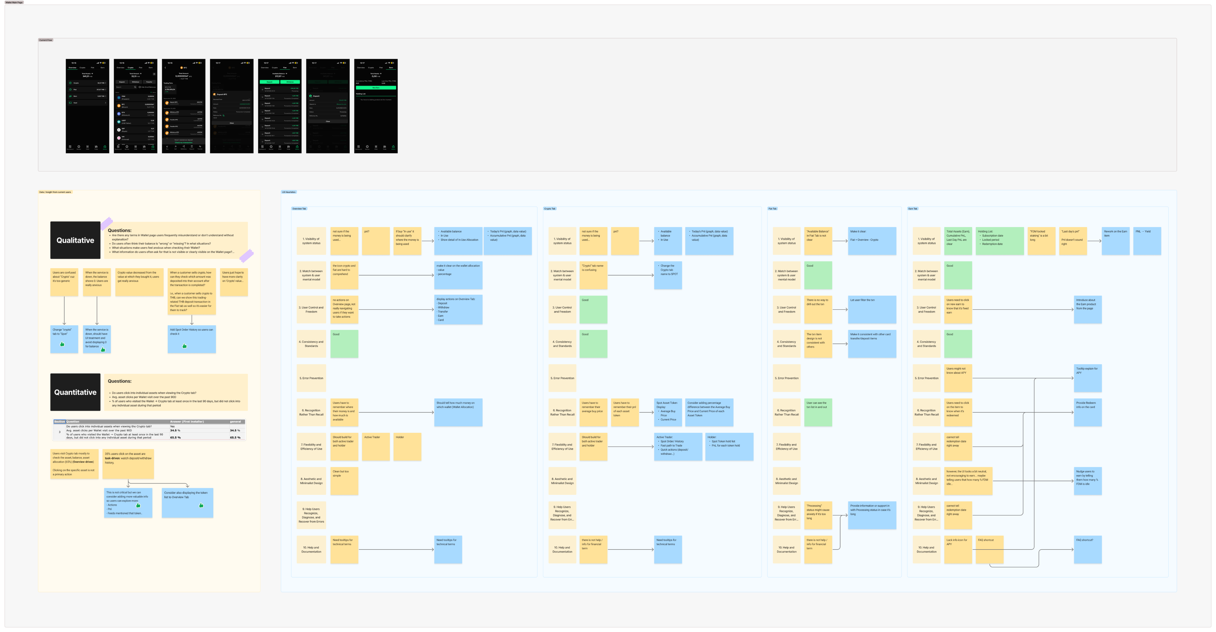
Although users frequently returned to the wallet, most interactions remained shallow. To clearly figure out what to enhance, I did the heuristic evaluation, competitive analysis, and asking feedbacks from CS team.
From these observations, I synthesized two core gaps the redesign needed to improve the reward in the habit loop:
🔴 Wallet didn’t help users confidently understand their assets
The wallet mainly showed balances, and gave users little understanding of how their portfolio was changing or what activities had happened across their assets. As a result, the experience felt passive and informational rather than actionable.
Insights from: Product Data, CS, Heuristic Evaluation
🔴 The wallet didn’t encourage deeper exploration and action-taking
Most wallet interactions ended after quick balance checks. Beyond the visible Earn tab, the experience gave users little reason to continue exploring, monitor opportunities, or move into trading and earning actions.
Insights from: Product Data, CS
Designing the solution
Turning insights into product directions
After identifying the core problems, I mapped them into a set of product directions and feature opportunities for the wallet redesign. Before moving into detailed UI design, I worked closely with the PM and engineering team to validate the feasibility and scope of these ideas.
Final design
Goal 1: Help users confidently understand their assets
Users can track portfolio performance and understand asset allocation over time
Users can quickly scan how each asset contributes to their overall portfolio
Users can evaluate a specific asset with deeper performance and position details
Users can clearly track what happened across their wallet activities
Users can clearly understand where their funds are being used
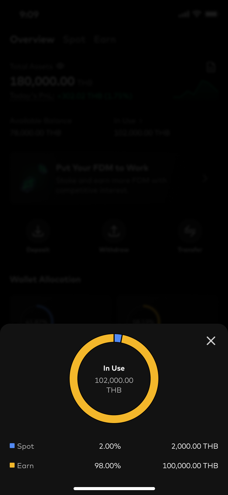
Users can quickly understand which assets are available for actions and which are currently in use
Wallet Overview
Spot Wallet
Goal 2: Encourage deeper exploration and action-taking
Entry points for actions
Earn
Users can better understand whether an asset is performing well by seeing its PnL, average buy price, market sentiment, and earning opportunities
Users become aware that part of their portfolio is sitting idle and can be put into earning products
Users can compare staking options and preview estimated returns before committing funds
Reflection
How framing shaped the solution
One thing I reflected on from this project was how much the framing of a problem can influence the direction of a design. Sometimes, the requirement a product designer receives can sound very straightforward. In this case, simply “redesign the wallet.” But the way we choose to interpret that requirement can lead to very different outcomes.
If I had approached this purely as a usability redesign, the solution would likely have focused on improving layouts, navigation, and information clarity. Instead, by looking at the wallet through the lens of growth, the project became less about redesigning a screen and more about understanding why users returned and what they did afterward. That shift in perspective ended up shaping both the design decisions and the overall direction of the project.
Thinking about success beyond the redesign
Since the redesign was still in development at the time of this case study, I wasn’t able to measure post-launch impact yet. However, one thing I found important was thinking ahead about how success should eventually be evaluated, not only through usability improvements, but also through behavioral and business signals inside the wallet experience.
Instead of treating retention as a direct design outcome, I focused more on the engagement behaviors that could contribute to stronger long-term retention over time. Here are some metrics I could check later:
Engagement signals
Move users beyond simple balance checking toward more active asset engagement.
Repeat wallet visits
Asset detail views
Interactions with trading and earning entry points
Business signals
Turn wallet engagement into meaningful financial actions.
Trading conversion from wallet
Staking conversion from wallet
Acknowledgement
This project benefited greatly from collaboration across multiple teams.
Special thanks to Proud Srisa-an (Product Manager) for connecting me with the right stakeholders and helping coordinate the project. I also appreciate Jesada Hongsi (Frontend Engineer) for managing the Google Analytics setup, making sure events were tracked correctly, and sharing internal training on how to read product data. Sukit Kajonpradapkul (Business Intelligence) contributed quantitative insights beyond GA dashboards, helping me validate patterns in user behavior. Finally, Sutthikan Singkhonart (Customer Support) shared qualitative insights from real user interactions, helping surface pain points that were not visible in analytics alone.
This project would not have been possible without their collaboration and support.
More case studies
Let's work together
Feel free to reach out. I’d love to hear what you’re working on.
Work
About me
Notes
Gallery
Contact
Redesigning Crypto Wallet to Improve Asset Engagement
Through product data, behavioral analysis, and customer feedback, I uncovered friction points that limited deeper engagement and redesigned the wallet to encourage more exploration and financial actions.
What I did
Behavioral data analysis
Problem framing
Hypothesis formation
Interaction design
Cross-functional collaboration
Collaboration
Proud Srisa-an (PM)
Jesada Hongsi (FE)
Sukit Kajonpradapkul (BI)
Sutthikan Singkhonart (CS)
Company
Timeline
Jan - Feb 2026
Background
Overview
Bitazza is a cryptocurrency exchange based in Thailand. It allows users to buy, sell, and trade digital assets on both web and mobile.
As the platform grew, Bitazza started a broader product revamp to improve the overall app experience. One key area was the Wallet. The existing one was originally built during the early MVP stage, before the company had an in-house product design team. Because of this, that interface focused mainly on functionality rather than long-term user experience.
My role
I led the end-to-end redesign of the Wallet as part of a broader product revamp.
The initial goal was to improve the wallet experience and interface that had been built during the early MVP stage. However, after reviewing product data, user behavior, and customer support feedback, I found that the problem went beyond usability.
Most users only used the wallet for quick balance checking, with very little engagement afterward. This shifted the project direction from redesigning wallet flows to exploring how the wallet could become a place users would return to and engage with over time.
What the data revealed
The status quo of Bitazza: Retention and Engagement
I started by reviewing product data over the past 180 days (Jun 1 – Dec 31, 2025).
At a high level, retention showed a gradual decline over time. We had around 167k active users, but 114k of them were new users.
This suggested that while the platform continued acquiring new users, many users did not develop a strong habit of returning.
Looking into engagement metrics, users spent an average of 59 minutes in the app over six months, suggesting that most interactions were brief and transactional rather than ongoing engagement behaviors. Also, the DAU/MAU ratio was also around 14%, indicating relatively low daily engagement across the platform.
Now, I decided to deeper into the screen-level engagement. It's easy to spot that wallet-related screens accounted for only a small portion of total interactions compared to other parts of the product like Dashboard or Market. This means that users mainly treated the wallet as a place to check balances rather than manage assets.
Then... what outcome should I aim at?
In product growth, engagement is one of the inputs that drives retention. Retention measures how many users continue returning over time, while engagement reflects how meaningfully users interact with the product once they return.
In this case, retention wasn’t something the wallet redesign could solve directly. The more practical way was to improve how users engaged with their assets. Strengthening wallet engagement would then become one of the ways to support better long-term retention across the product.
👉 The opportunity wasn’t only to improve wallet usability, but to make the wallet a place users would actively return to and engage with, helping support stronger long-term retention across the product.
Reframing wallet engagement behavior
Understanding the habit loop
To better understand why wallet engagement remained shallow, I mapped the current experience using an engagement loop framework.
Strong engagement loops are created when users repeatedly experience meaningful rewards after taking an action.
Current Bitazza wallet habit loop
In crypto products, triggers already happen naturally: price movements, volatility, and portfolio fluctuations continuously bring users back. However, the current wallet experience failed to turn those moments into deeper engagement behaviors. This is because the reward was weak, users can only see their balance.
Current wallet had only some basic information about the balance. This didn’t seem to motivate users to revisit this page more often.
The reward was too weak to reinforce continued engagement, causing most interactions to end after quick balance checks.
Investigating the weak reward experience
Although users frequently returned to the wallet, most interactions remained shallow. To clearly figure out what to enhance, I did the heuristic evaluation, competitive analysis, and asking feedbacks from CS team.
From these observations, I synthesized two core gaps the redesign needed to improve the reward in the habit loop:
🔴 Wallet didn’t help users confidently understand their assets
The wallet mainly showed balances, and gave users little understanding of how their portfolio was changing or what activities had happened across their assets. As a result, the experience felt passive and informational rather than actionable.
Insights from: Product Data, CS, Heuristic Evaluation
🔴 The wallet didn’t encourage deeper exploration and action-taking
Most wallet interactions ended after quick balance checks. Beyond the visible Earn tab, the experience gave users little reason to continue exploring, monitor opportunities, or move into trading and earning actions.
Insights from: Product Data, CS
Designing the solution
Turning insights into product directions
After identifying the core problems, I mapped them into a set of product directions and feature opportunities for the wallet redesign. Before moving into detailed UI design, I worked closely with the PM and engineering team to validate the feasibility and scope of these ideas.
Final design
Goal 1: Help users confidently understand their assets
Users can track portfolio performance and understand asset allocation over time
Users can quickly scan how each asset contributes to their overall portfolio
Users can evaluate a specific asset with deeper performance and position details
Users can clearly track what happened across their wallet activities
Users can clearly understand where their funds are being used
Users can quickly understand which assets are available for actions and which are currently in use
Wallet Overview
Spot Wallet
Goal 2: Encourage deeper exploration and action-taking
Entry points for actions
Earn
Users can better understand whether an asset is performing well by seeing its PnL, average buy price, market sentiment, and earning opportunities
Users become aware that part of their portfolio is sitting idle and can be put into earning products
Users can compare staking options and preview estimated returns before committing funds
Reflection
How framing shaped the solution
One thing I reflected on from this project was how much the framing of a problem can influence the direction of a design. Sometimes, the requirement a product designer receives can sound very straightforward. In this case, simply “redesign the wallet.” But the way we choose to interpret that requirement can lead to very different outcomes.
If I had approached this purely as a usability redesign, the solution would likely have focused on improving layouts, navigation, and information clarity. Instead, by looking at the wallet through the lens of growth, the project became less about redesigning a screen and more about understanding why users returned and what they did afterward. That shift in perspective ended up shaping both the design decisions and the overall direction of the project.
Thinking about success beyond the redesign
Since the redesign was still in development at the time of this case study, I wasn’t able to measure post-launch impact yet. However, one thing I found important was thinking ahead about how success should eventually be evaluated, not only through usability improvements, but also through behavioral and business signals inside the wallet experience.
Instead of treating retention as a direct design outcome, I focused more on the engagement behaviors that could contribute to stronger long-term retention over time. Here are some metrics I could check later:
Engagement signals
Move users beyond simple balance checking toward more active asset engagement.
Repeat wallet visits
Asset detail views
Interactions with trading and earning entry points
Business signals
Turn wallet engagement into meaningful financial actions.
Trading conversion from wallet
Staking conversion from wallet
Acknowledgement
This project benefited greatly from collaboration across multiple teams.
Special thanks to Proud Srisa-an (Product Manager) for connecting me with the right stakeholders and helping coordinate the project. I also appreciate Jesada Hongsi (Frontend Engineer) for managing the Google Analytics setup, making sure events were tracked correctly, and sharing internal training on how to read product data. Sukit Kajonpradapkul (Business Intelligence) contributed quantitative insights beyond GA dashboards, helping me validate patterns in user behavior. Finally, Sutthikan Singkhonart (Customer Support) shared qualitative insights from real user interactions, helping surface pain points that were not visible in analytics alone.
This project would not have been possible without their collaboration and support.
More case studies
Designing Trust in Crypto Withdrawal (On-chain)
Reduce uncertainty and help users complete withdrawals with confidence.
Read case study
Designing a Dispute Workflow for Sidekick CRM
Enabling frontline agents to create and track dispute cases directly inside Sidekick.
Read case study
Let's work together
Feel free to reach out. I’d love to hear what you’re working on.